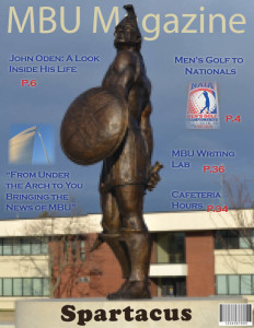
This project was created by Rerich in his Editing and Design for Print Media class. It is an example of a magazine layout and what it could look like.
****Notice – This picture above is my original cover for the magazine project. There are some fonts and images that do not sync with the various devices I have used to export this PDF, but 99% have.
Also this was created on a 2-page spread on InDesign. Please recognize that the pages do go together.

Leave A Comment